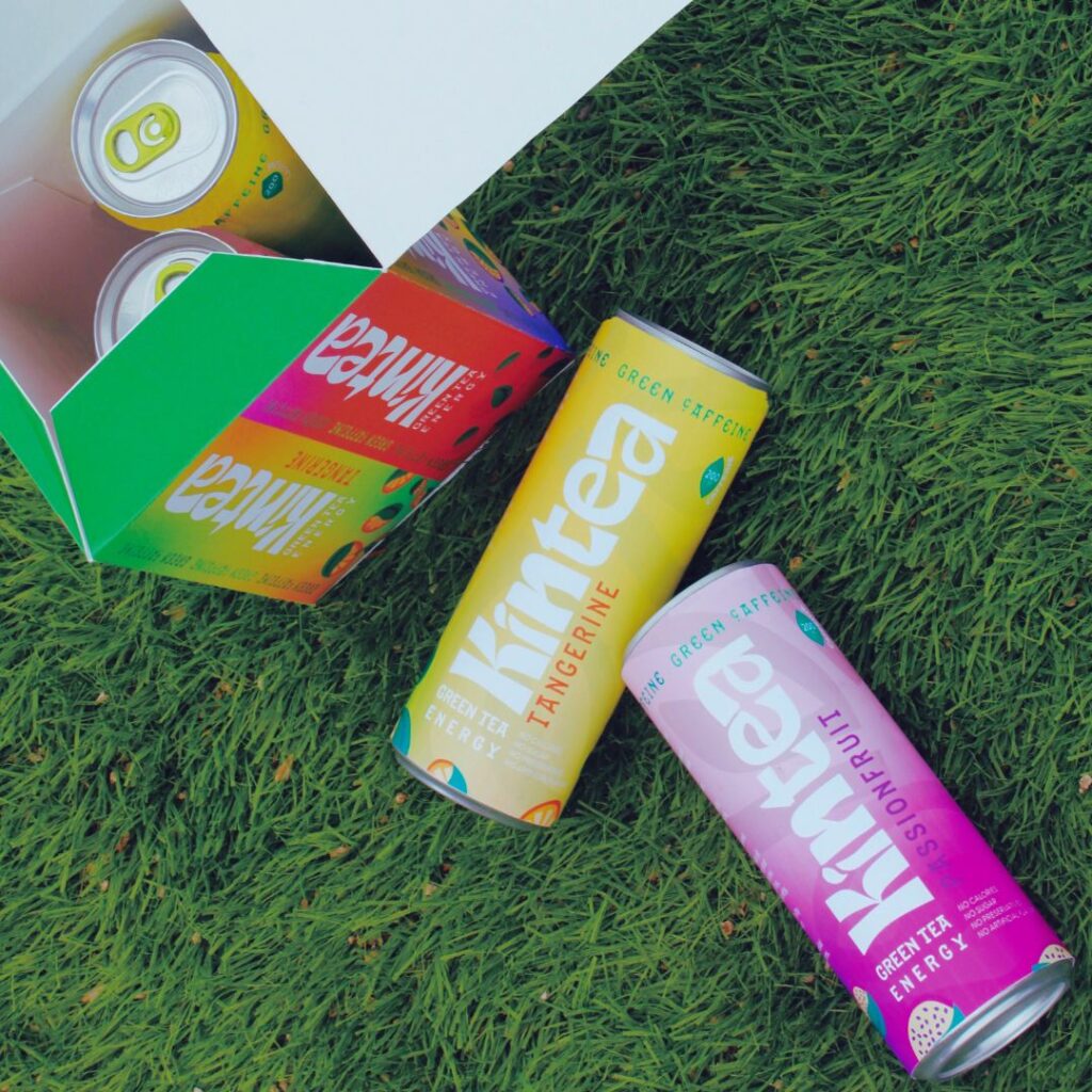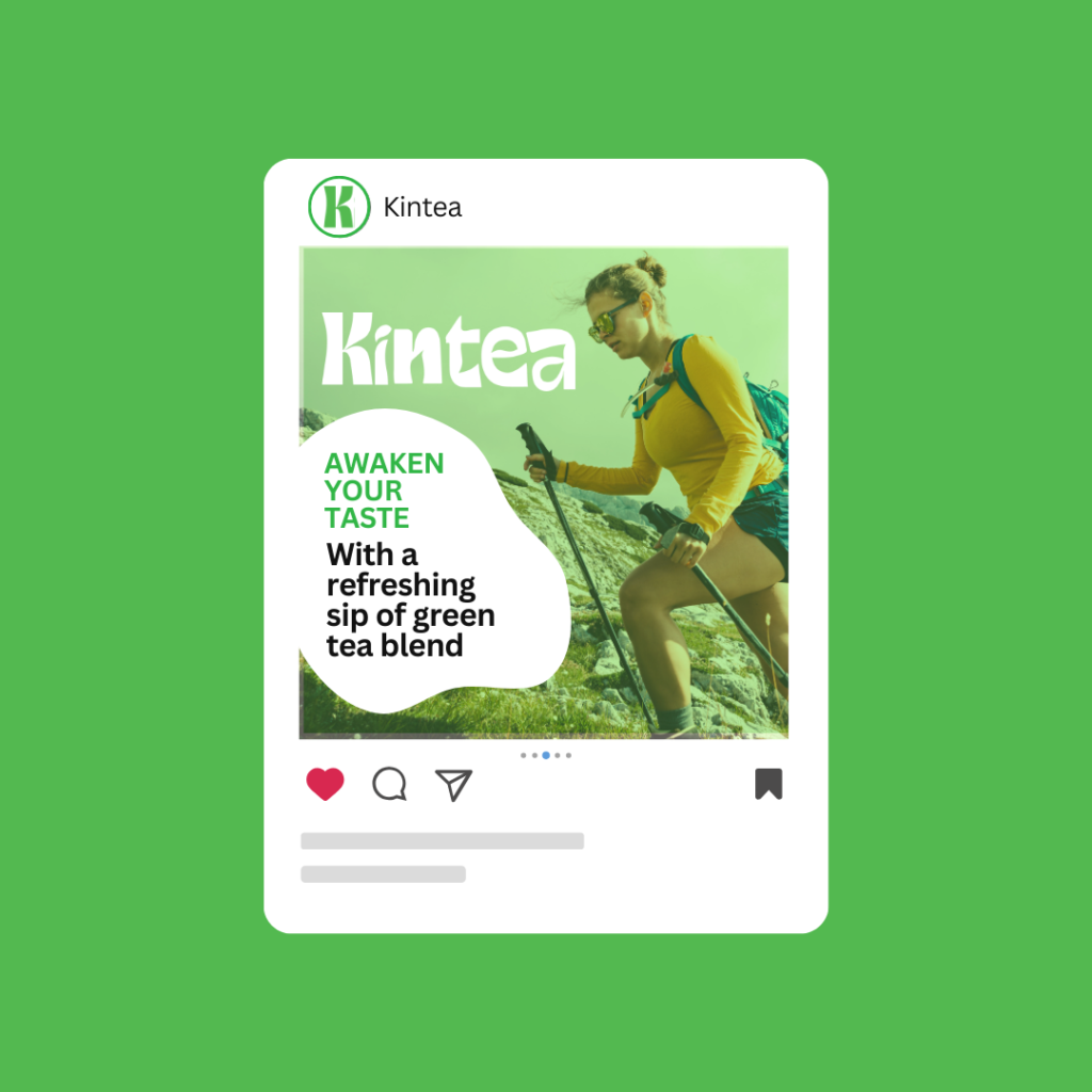
Kintea, a brand synonymous with natural green tea infused with the vibrant energy of passion fruit, tangerine, raspberries, and kiwi flavors. In crafting this brand, our primary objective was to maintain a base of bright green, symbolizing an organic aesthetic. Complementing this, we introduced gradient variations of pink, purple, yellowish-green, and orange to accentuate the diverse and rich flavors within the brand palette. The logo is designed to encapsulate the brand’s essence. The use of bold typography reflects the robust and energizing nature of the product. The incorporation of gradient variations into the logo design serves as a visual cue, hinting at the diverse flavor offerings within Kintea.


Bright green, at the brand’s core, reflects freshness and natural purity. The gradients represent the transition and infusion of flavors, symbolizing the energetic burst one experiences with each sip. The dynamic interplay of colors not only reflects the product’s richness but also captures the attention of consumers, inviting them to explore the variety within the brand. The foundational color, bright green, serves as a visual anchor, symbolizing the organic nature of the product. This color choice aligns with the core identity of natural green tea. To enhance the visual storytelling and showcase the diverse flavor profile, gradient variations of pink, purple, yellowish-green, and orange are introduced. Each gradient corresponds to a specific flavor, allowing for a harmonious yet distinctive brand palette.


The use of color aims to evoke emotions and create a connection with the consumer. Bright green communicates freshness and health, while the gradients convey a spectrum of taste experiences. This visual appeal engages customers, prompting them to explore the product and appreciate the diverse flavor options offered by Kintea.


Consistency is key in maintaining brand recognition. The color palette is consistently applied across all branding elements, from packaging to promotional materials. This approach ensures that the brand’s visual identity remains cohesive and memorable.


