
Pure Tea is conceived as an organic tea brand that not only offers a sensory experience but also embodies the essence of nature. The primary objective is to harmonize colors with distinctive tea flavors, creating a holistic and visually compelling brand. The logo design serves as a visual anchor, combining bold and energetic typography with undulating waves that mimic the flow of water. This transformation adds a dynamic element, symbolizing the fluidity of tea and creating a sense of movement and energy.
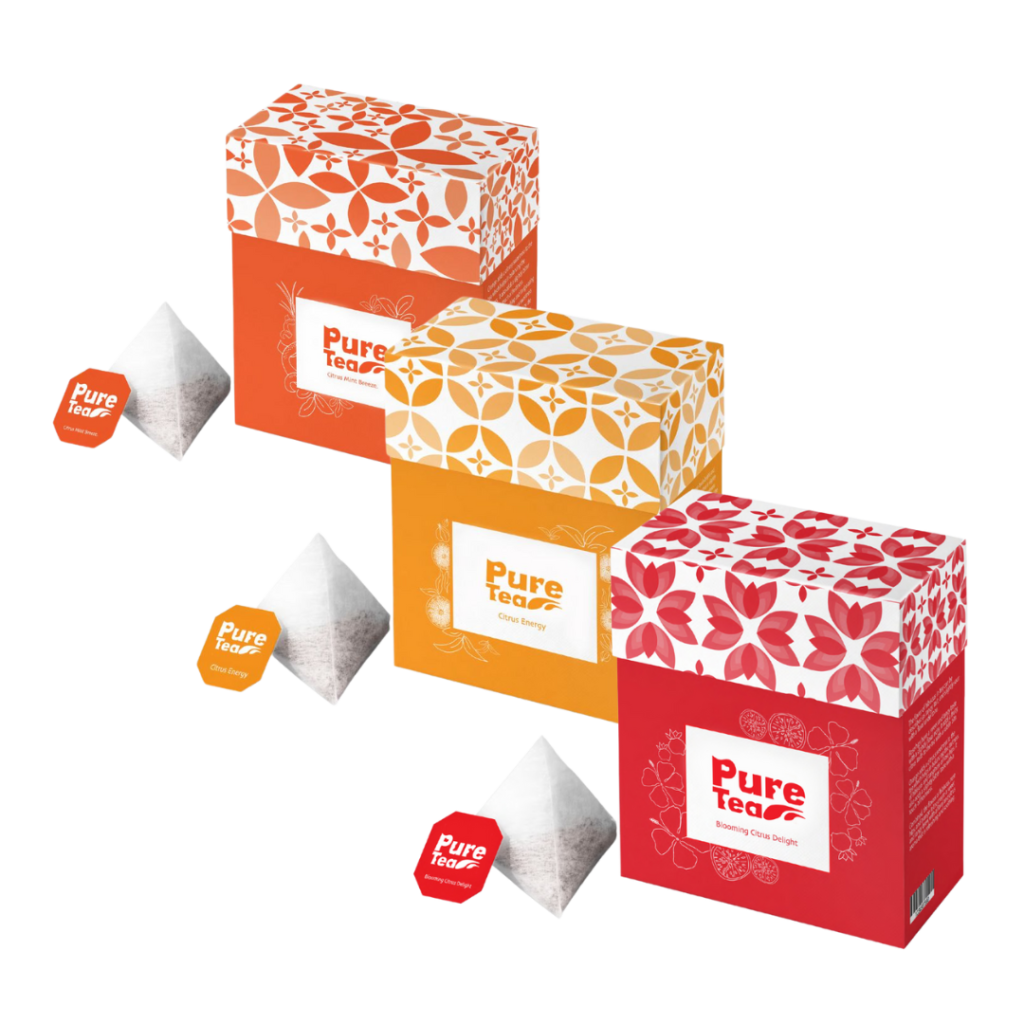
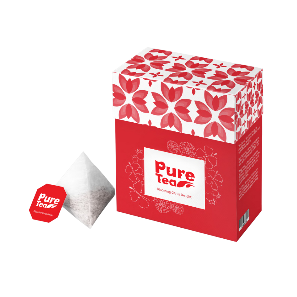
The choice of an orange, yellow, and red palette is a deliberate reflection of the citrus-infused lineup. These warm and energetic hues encapsulate the zesty citrus delight, refreshing citrus mint breeze, and invigorating citrus energy, establishing a vibrant connection between color and flavor. Graphics play a pivotal role in showcasing the ingredients on the packaging. This visual representation offers consumers a glimpse into the exquisite composition of the tea. The combination of vibrant colors and intricate patterns enhances the overall aesthetic appeal, inviting customers to explore the product further. Patterns featuring leaf shapes are strategically employed to create unique visual identities for each flavor. The variations in the leaf patterns, set against different backgrounds, contribute to individual flavor recognition. The deliberate use of a monochromatic scheme ensures that each blend stands out distinctly.
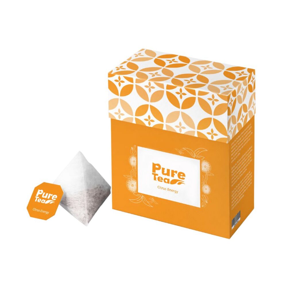
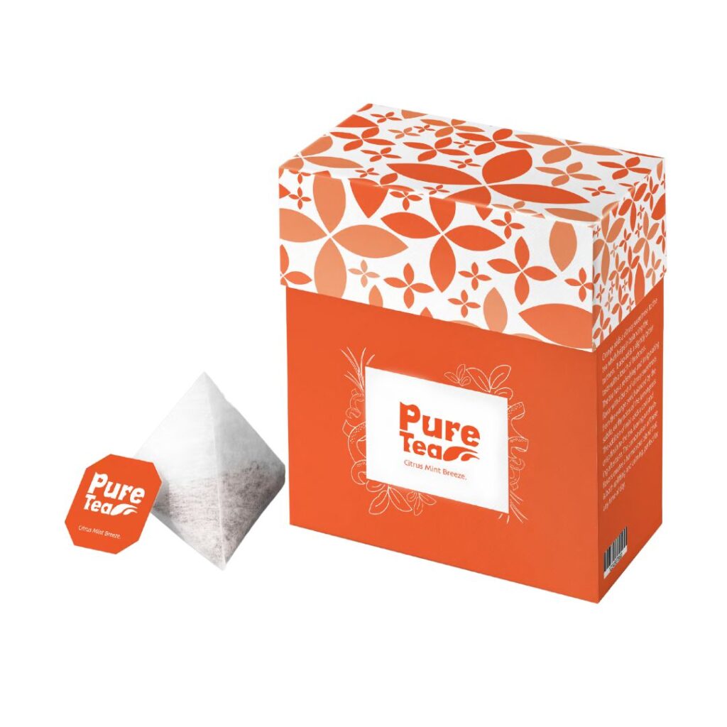
Envisioning an overarching brand pattern, symbolized by water drops, reinforces the logo’s fluid aesthetic. This consistent element ties together the diverse flavors under a unified visual theme, fostering brand recognition and cohesion across the product line.
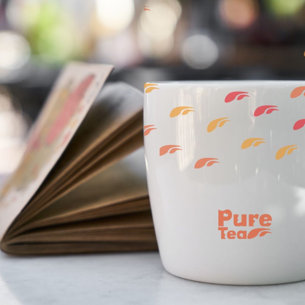

Pure Tea is positioned as more than just a beverage; it’s a journey through vibrant flavors and thoughtful design. The intentional use of colors, patterns, and graphics creates a visual narrative that complements the brand’s commitment to purity and a sensory tea experience.


