Work

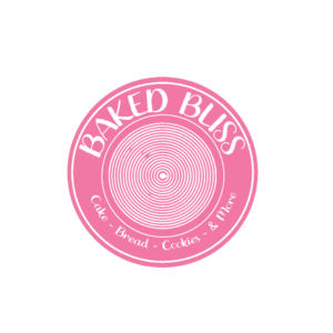
Backed Bliss is a brand specializing in freshly baked bakery products and coffee. I opted for vibrant colors inspired by citrus, strawberry, and lemon to convey the freshness and radiance of their baking. The choice of a circular logo reflects a classic and established look, mirroring the round and curvy shapes typical of bakery items. I took inspiration from bakery menus, particularly rolls, to craft a unique circled wheel graphic for the logo. The goal of my design choices was to establish a brand that is fresh, curvy, and visually appealing.

Kintea, a brand synonymous with natural green tea infused with the vibrant energy of passion fruit, tangerine, raspberries, and kiwi flavors. In crafting this brand, our primary objective was to maintain a base of bright green, symbolizing an organic aesthetic. Complementing this, we introduced gradient variations of pink, purple, yellowish-green, and orange to accentuate the diverse and rich flavors within the brand palette.

Floral Skin Care: A natural flower-based skincare line blending flowers, vitamins, and acids. Crafting this brand involved color harmony with individual flower blends under a soothing monochromatic theme. Products feature Blue Lotus, Cherry Blossom, and Calendula, each reflecting their distinct flower color resulting in a yellow, blue, and pink color palette.Patterns, mirroring each flower’s silhouette, create unique visuals for Blue Lotus, Cherry Blossom, and Calendula, maintaining contrast through a monochromatic scheme. These patterns extend to packaging, serving as indicators for the ingredients within, providing a visual representation of the natural elements in each product.

An organic tea brand boasting natural blends that captivate the senses. In shaping this tea venture, my vision was to harmonize colors with the distinctive tea flavors, adhering to a monochromatic theme. The citrus-infused lineup includes a zesty citrus delight, a refreshing citrus mint breeze, and an invigorating citrus energy. Opting for an orange, yellow, and red palette perfectly encapsulates the essence of these flavors. Graphics play a vital role, showcasing the ingredients on the packaging, and offering a visual glimpse of the tea’s identity.
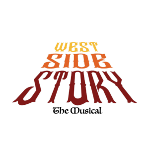
As I embark on the design rationale for the West Side Story ad campaign, my choice of an old-style typeface for the logo, juxtaposed against a road backdrop, is a deliberate homage to the musical’s historical setting in the 1950s. The vintage typeface not only radiates nostalgic charm but also seamlessly aligns with the retro aesthetics of that era, ensuring a visually cohesive appeal. Placing the logo on the road introduces a dynamic element, symbolizing the characters’ journey and crafting a visual narrative that resonates with the musical’s central themes of choices.

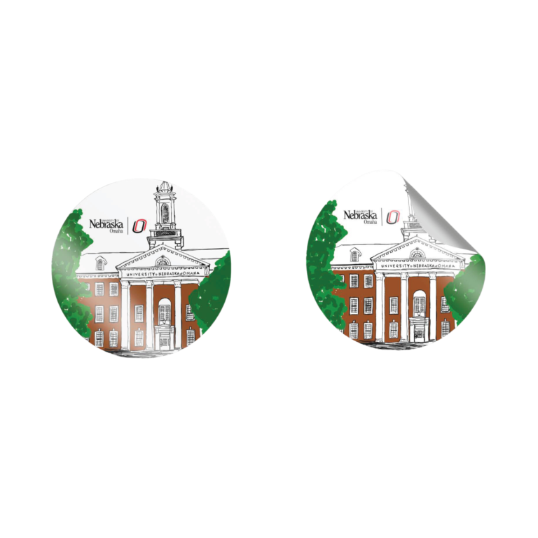
The university collection isn’t just about clothing and accessories—it’s a celebration of shared experiences, a visual representation of our campus’s soul, and a means of supporting the ongoing legacy of academic excellence. Embrace the spirit of your university with our exclusive collection and carry the essence of campus life with you wherever you go. University merchandise fosters a sense of community among students, faculty, and alumni.
Talk to me
Have any questions?
I am always open to discussing new projects and creative opportunities.


